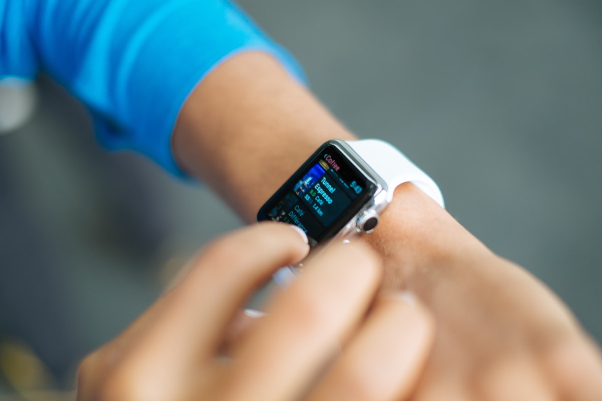
My watch tells me my VO2max is 44. It offers this to two significant figures, in a confident sans-serif, the way it might tell me the time. It is a nice number. It puts me, a woman in her late thirties, somewhere in the "excellent" band on the little colored bar. What the watch does not mention is that it has never measured a single molecule of oxygen going into or out of my body, which is the only thing VO2max actually is.
VO2max, the maximum rate at which your body can take in and use oxygen, is one of the strongest predictors of death we have ever put a number on. And the version of it glowing on your wrist is an estimate wrapped around an assumption wrapped around a population average that may not be you.
Start with the part that earns the hype. In 2018, cardiologists at the Cleveland Clinic published a retrospective cohort, a look back through the records of 122,007 patients who had done a treadmill stress test, the kind where they actually push you to exhaustion and measure what you can do (Mandsager et al., JAMA Network Open, 2018). Over a median of 8.4 years, 13,637 of them died. When the authors sorted people by fitness and adjusted for the usual confounders, the least-fit group carried an all-cause mortality hazard ratio of 5.04 against the elite group, which is a technical way of saying roughly five times the risk of dying over the study's window. There was no upper limit of benefit: the extremely fit kept doing better than the merely fit.
The number that stops people is the comparison. In that same dataset, being a smoker carried an adjusted hazard ratio of 1.41, about 41 percent higher risk. Diabetes was 1.40. Coronary artery disease, actual diagnosed heart disease, was 1.29. Sitting at the bottom of the fitness distribution was associated with a bigger jump in mortality risk than any of them. The authors put it plainly: the risk of reduced cardiorespiratory fitness "was comparable to or greater than traditional clinical risk factors."
Read that chart honestly, though, because I am going to ask you to do the same with your watch. This is an observational cohort of people who were referred for a stress test, not a random slice of humanity and not a trial where anyone was assigned to be unfit. The fitness bar compares the lowest group to the elite; the smoking bar compares smokers to non-smokers. The reference groups are not identical, so this is not a clean like-for-like ranking. What it is, is four hazard ratios from one model, and in that model low fitness is the heaviest of them. That is where the "worse than smoking" line actually comes from, and it is more solid than most wellness claims I take apart. The underlying gradient, roughly a 13 percent drop in mortality for each added MET, the standard step of exertion, has been visible in observational meta-analysis since at least Kodama's 2009 work in JAMA. It is old, replicated, and about as close to a genuine signal as this field offers.
Which brings me to the study that put this topic back in the news, and to why I want to slow down. A 2026 paper in Scientific Reports looked at 340 people across 24 countries who had run, on average, 121 marathons each (Lundy et al., Scientific Reports, 2026). Their aerobic capacity sat well above population norms, and the age gradient across the group was gentler than the standard curve predicts. The press framing wrote itself: marathons keep you young. The paper's mortality figure, that 3.7 percent lower risk per additional milliliter of oxygen per kilogram per minute, got quoted everywhere. One MET is about 3.5 of those milliliters, so this is the same Kodama gradient in smaller units, not a rival number that disagrees with it.
Here is what the coverage left out. The VO2max values in that study were self-reported, gathered through an online survey. It is cross-sectional, a single snapshot, so it cannot watch anyone decline or fail to. The 3.7 percent figure is not something the study found; it is borrowed from existing meta-analytic data and laid over the results as illustration. And the authors themselves, to their credit, wrote the sentence the headlines skipped: "These findings should not be interpreted as evidence of slowed physiological decline." They flag survivorship bias openly. People who complete 121 marathons are, definitionally, people whose bodies let them. That is a story about who survives to keep running, not proof that running is what does the surviving.
So the mortality math is real and worth respecting. Now the watch.

The best-controlled test I can find compared Apple Watch estimates against indirect calorimetry, the lab method that actually samples the air you breathe (Lambe et al., PLOS ONE, 2025). Twenty-eight people. The watch underestimated true VO2max by an average of 6.07 milliliters, with a mean absolute percentage error of 13.3 percent. The limits of agreement, the band that should contain almost everyone, ran from minus 6.1 to plus 18.3, a spread of about 24 units, which is the difference between "unfit" and "athlete." The authors concluded the estimates are "not sufficiently accurate to inform clinical decision-making." That sample happened to be quite fit, so the size of the underestimate is specific to them, but the wide error bar is the durable finding.
There is a reason it behaves this way. No watch measures oxygen. It infers your maximum from the relationship between your pace and your heart rate at efforts well below maximum, then extrapolates to a ceiling you never touched, against a template built from other people. Validation work keeps finding the same quirk: these devices pull toward the average, flattering the unfit and shortchanging the fit (JMIR Biomedical Engineering, 2024). Pool the brands together and you get a small average bias hiding wide individual error, which is a statistician's way of saying the number is decent for a crowd and unreliable for you.
So use it as the thing it is. The trend is the signal. If your estimate drifts up over a season of training, that direction is probably real, even if the digits are not. The single number, read on a Tuesday and taken personally, is fiction with good production values. I know the feeling it manufactures, the small dread of a score that ticked down, the same low-grade anxiety I have written about with sleep rings. Do not let a guess do that to you.
And the thing the mortality data keeps pointing at was never for sale in the first place. Aerobic capacity is trainable. You raise it by being out of breath more often, sometimes properly hard, most weeks, for years. That is free. The watch is the one part of all this that costs four hundred dollars and knows the least.